
Spending hours of your life looking at stock charts and getting nowhere? Then you have come to the right place and this guide is the perfect fit for you.
Reading stock charts is an extremely easy skill to learn but needs to be taught properly because when done wrong you will run the risk of losing money in the market. This article is broken down into sections that start from the most basic and work their way up to the professional tips and tricks.
In essence, this article is the only guide you will ever need. The goal here at ChronoHistoria is to help people generate wealth in the market, as such one of the ‘building-blocks’ of investing/trading is learning to read market charts.
As always if you like content like this then you should subscribe to the newsletter and share around on social media. Every share helps me help others so it’s much appreciated.
Without wasting any time, let’s jump right into the guide.

About the Author
Any article should include a small introduction so you know my experience and background. Or the ‘I’m not blowing hot air section.’
I am a professional investor/trader who has over a decade of industry experience working at buy side funds as a research analyst. My sole purpose is to generate Alpha, or above normal market returns, for clients.
I write anonymously here because I run a consulting business for several funds in the U.S and if savvy investors could figure out my name they could link the investment methodologies I discuss to the funds, thus jeopardizing returns through Alpha decay.
I started ChornoHistoria as a way to help the average investor generate higher returns in the market, well above 10% per year. If you’re interested in the awards/accolades in the field, check out the about me section.
Also I am known to cause problems in the market from time to time. I guess you can say I have been ‘featured’ on CNBC.
Anyways, let’s get to the first section. The chart platform of choice.
The Chart Platform
There are multiple platforms you can use to obtain stock charts. My personal favorite is ThinkorSwim but you could use Yahoo finance or any other professional trading platform.
The first step to learning how to read charts is to find the trading platform of your choice. I recommend Think or Swim because it’s a near copy of my Bloomberg terminal. Also it has several really cool features such as python scripting and auto sector evaluation.
For the purposes of this article I will be focusing on Think or Swim. That being said, everything I will discuss can be applied to any stock charting platform. Each platform will display the same charts at the same time frequency. As such any platform will work.
The reason you should get onto a professional trading platform is because it is the right tool for the job. You will be able to invest/trade properly and see all the necessary information to make an educated decision in the market.
Now let’s break down the chart window.
Breaking Down the Chart Window
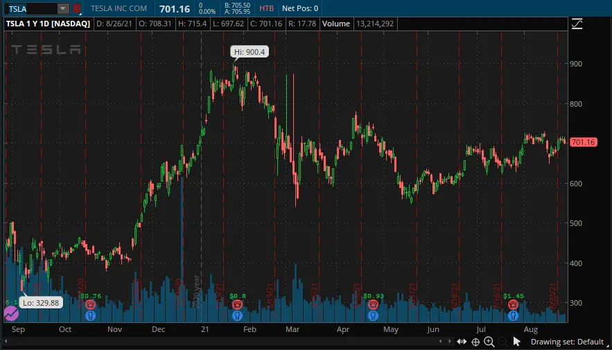
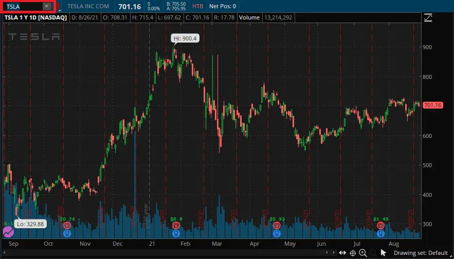
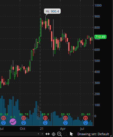
What we see in the above image is a one year chart on the stock price of Tesla Inc. This chart might seem overwhelming at first but don’t worry I am going to walk you through how you should ‘read’ this and what everything means.
The first step is to understand the moving chart itself. The best way to do this is to break down each ‘tick’ on the chart. P.S it’s the green and red stuff.
These ‘ticks’ are called Japanese Candlesticks and over time they have become the default way to draw charts.
Japanese Candlesticks
This is the foundation of reading charts.
In 1700 a merchant in Japan started plotting out the rise and fall of rice prices. This was nothing new as knowing market prices is 101 of business, what was new however was the way this merchant tracked the prices. (Source)
The Japanese Merchant introduced chronology, open and closing price, and mean price into one chart. This significantly lowered the amount of time it would take to gather information on rice prices.
The end result? The Japanese Merchant would come to gain market information faster because he had four charts combined into one. The price over time, the open and closing price for the time period, and the average price for the time period.
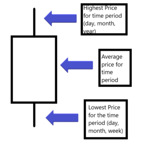
The middle, fat part, of the above image is the candle itself. You will notice two lines coming out of the top and the bottom of the ‘candle’, these are the wicks.
Each candle can represent a time period that you set. For example, you can look at Tesla over the past year on a daily increment. Each candlestick therefore would be daily.
The middle candle part would be how much TSLA moved on average during that day. The little lines coming out of the body of the candle are the wicks. These are most that TSLA moved outside of the mean during the time period.
Now let’s apply this to the TSLA chart.


You can slide between the above image. On the left is the 1 year chart on TSLA broken down into daily candle’s. On the right is the chart zoomed into the month of July 2021 to show each individual candle.
When TSLA’s daily candle closes at a higher price then the day before the candle will be green for the day. Likewise if the candle closed below the previous day then the candle would be red.
This history of Candle Sticks is what makes the chart. It takes some time and practice to read candlesticks easily, but trust me after looking at a couple charts you will pick it up. Once you can look at a chart and instantly know the average price, the high, and the low for the day then you’re golden.

Volume
The most important thing to look for before even investing is the volume on a stock. This can’t be understated.
Volume on a stock is simply how many shares are being bought or sold for the time period on the candlestick. If your candlesticks are set to be daily, then the volume for that candle will be daily. Likewise if your candlesticks are set to be weekly then your volume will be weekly.
Volume can be thought of as how many items are being sold at an auction. You have buyers who want to get the item(stock) at the best possible price. On the other hand you have sellers who own the items who want to sell it at the highest price. The amount of times that these two parties, the buyers and sellers, agree is the total volume for the day.
If your stock of choice has low volume then don’t invest. This is because you will never be able to ‘liquidate’ your investment back into cash if nobody wants to buy it.
To figure out how ‘liquidity’ and volume intersect to create risk to your investment I recommend checking out this article.
So how do we see volume on a stock easily? Let me show you.


Swipe the above image left to right. On the left image the red box outlining the blue lines is what you should look at. These blue lines are the volume on the stock per candlestick.
If you were to put your mouse cursor over the blue line then you would get a volume number for that candle stick. In the right image the bottom red square highlights the mouse cursor while the top red square highlights the volume for that candlestick.
Since this chart on TSLA is of 1 year on daily candles then we can see that on 03/09/2021 the daily volume for that trading day on TSLA was 67 million shares.
Just like the candlesticks, learning to find and track volume will take time. Practice it however and you will be rolling in cash.

The Ticker/Stock’s Publicly Traded Symbol.
Ok, so how do we find or navigate to the stock of our choice? In the above image the red square in the top left is where you will find the stock ticker. For Tesla inc their stock ticker is TSLA.
Every single publicly traded stock in the world has a ‘ticker’ or list of characters associated with it. For Tesla in the above image their ticker is TSLA. Other companies such as Apple have the ticker AAPL, Microsoft has MSFT, and Google has GOOG.
If you want to find the ticker for a company simply Google “(company name) stock ticker” and you will figure it out.
It’s important to understand that each ticker is independent of a company. Sometimes a company’s ticker is not relevant to their company name at all and takes a bit of digging to find out.
This ‘skill’ is just a simple google search. Still it’s a very valuable piece of information, because well if you can’t find the ticker you can’t invest.
Hi/Low Price
As we can see from the above image. The highest price that Tesla hit during September 2020-August 2021 was $900.40.
Likewise lowest that TSLA hit during this same time period was $329.88.
Now this is a huge increase in price. Over the span of a year you could have nearly tripled the amount of capital you would have put into an investment. If you put in $20,000 when TSLA was valued at $330 and sold a couple months later you would have made $60,000 or a 300% return on investment.
Knowing the high and low price of a stock is great to understand the range that a stock would bounce in or what number it needs to beat to hit a new all time high.
Special Events (Earnings Reports, Dividends, Stock Splits, etc.)
I lumped dividends, earnings, stock splits, and all other events that might show up on the chart into the Special Events category.
These are typically placed at the bottom of the chart and are major events that will impact the price of the stock.
Here are some of them broken down by what you most commonly see.
Earnings Reports
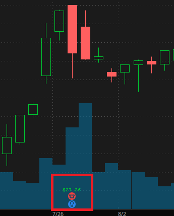
The above image is of the chart during GOOG’s (Google) earnings report on 07/26/2021.
As we can see from the red circle there are two different symbols in the Think or Swim trading platform. The first is the red telephone. This is the earnings call report where the executive team will have a meeting with investors to discuss their recent earnings report.
These are great for finding out other outside information on how the company is doing that you typically wont find in a normal report.
The second symbol is the blue light bulb. This announces that earnings for the company were released. If you go to the company’s ticker on SEC.GOV (or your country’s regulated exchange) then you can read this report.
Finally, the Green number is the EPS dollar amount. EPS is simply the Earnings per Share. This indicates how profitable a company is at this point in time. Google is an extremely profitable company. As such their earnings reports are pretty consistent with high EPS, such as $27 a share.
To calculate EPS simply input the following formula.
EPS = (Net Income-preferred share payout)/Common Shares
Investopedia has a good article on EPS.
Dividends
Ahh… dividends.
Dividends are payouts where just by owning the share you will receive money deposited straight into your brokerage account. This is because you are a shareholder of a company that pays out a portion of their net profit/revenue to the shareholders.
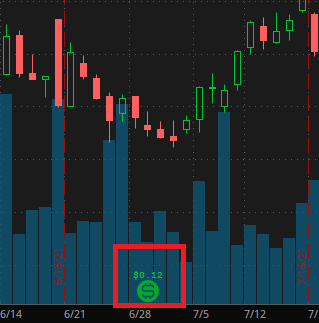
As we can see from the above image STAG paid out a dividend of $0.12 per share owned on 06/28/2021. This means that just by holding the stock you will receive a payout in the form of cash without selling your shares!
This is great as you can either directly spend this cash or just roll that payout back into the market and buy more shares of stag. Over time this will result in you building a dividend snowball account.
I personally know a lot of clients who did this early in their lives and let their capital dividend snowball out of control. They are multi millionaires and don’t really do anything nowadays.
One of the most famous dividend snowballers is Warren Buffet. In the 40’s-50’s Buffet placed some key investments in companies that were stable and offered long term growth. He never moved those investments and as such they compounded and snowballed out of control.

A lot of you guys think Buffet is a stock wizard…this is really him.
In many respects Buffet is the wealthiest man in the world if you discuss economic opportunity thrown on top of tangible wealth. If for example Buffet lived to be 200 years old then it’s very possible he could have a net worth of several trillion dollars! Just from compounding good stable stocks that have dividends.
Stock Splits
These are a bit rarer in the market but can tell extremely valuable information to investors.
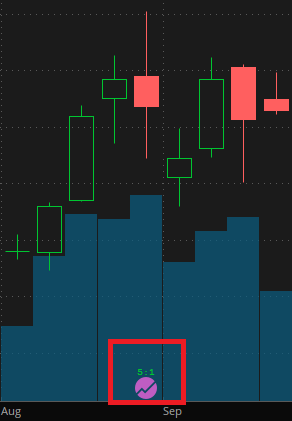
The above image is of TSLA, which in September of 2020 underwent a 5:1 stock split. This means that TSLA took every 1 share and split it into 5 of them. What this did was artificially drop the stock’s price.
Now if you invested off this it wouldn’t have affected you financially. This is because if you owned 300 shares of TSLA before now you own 1500 shares.
The reason why these splits are so important is because a company can go either way. They can artificially make their stock worth more and attract a different type of investor than a company who wants to lower their stock price artificially.
So the reason is why did TSLA increase their total amount of shares by 500%? Well it’s because one share of TSLA was going for $1,500 which was out of the price point of most retail investors.
At the time TSLA had not turned a profit or made any real products successful. As such they lowered the stock price artificially to allow retail investors to pour in.
As a result of this split retail investors could pour into the stock and thus the price drove up. In essence Elon opened up the floodgates for outside investment. All he had to do was cleverly design PR campaigns.
Conclusion
There you have it. That’s the absolute beginners guide to reading stock charts. If followed properly you will be off to the races and investing with the best of them.
This article serves as the foundation for your investment journey. Now we just need to work on proper research and trade positioning to make sure you return a profit well above market average year over year.
The next best place to go after this post is this article. It will give you the background necessary to make good investment judgments in the stock market.
As always if you like content like this you should subscribe to the newsletter and share on social media. I’m always down to help people in the markets!
Further, you can check out some of the other posts here!
-
How Long Does a Short Squeeze Last? (3 Answers)
What is the time frame for you short squeeze? Well here is everything you will ever need to know to determine how long it will last.
-
Why You Still Own a Stock After It’s Delisted and How to Sell It
Do you still own a stock after its delisted? How do you sell it? Don’t worry the stock is still worth money and here is how to sell.
-
Can You Make 1% A Day in the Stock Market? (3 Steps)
Making 1% a day in the stock market is hard but defiantly doable. Here are 3 simple steps to helping you achieve this return.
Until next time, I wish you the best of luck in your investment journey.
Sincerely,
